Visualizing data in Matlab
Data visualizations are a useful way to condense a large amount of information, and represent it in a format that is easy to read and interpret.
Generating a few visualizations is often easy once you have the data, and can be a good way to explore a data set. You might stop once you find a useful format and put together a script or app to provide up-to-date views, or just gather enough context to decide what to look into further.
In this post I’ll show how to generate line plots, box plots, histograms and scatter plots for a simple data set in Matlab. This data was sourced from Google Flu Trends (updated October 2014 model for United States 2013 data)*.
I’ll import data from a text file for simplicity. Each row of our data source represents a week of 2013.
googleFluTrendsData_US2013.txt:
2013-01-06,3.741,2.879,4.219,4.323,3.299,3.445,6.814,4.643,3.231,2.604,2.654
2013-01-13,4.673,3.163,4.935,4.872,3.203,3.893,7.518,5.329,3.853,4.052,2.926
...
The first two columns store the date of the first day of the week and the estimated flu frequency for the United States as a whole. The remaining ten columns, which we’ll use for our visualizations, store the estimated flu percentages for standard federal regions 1 to 10. (https://en.wikipedia.org/wiki/List_of_regions_of_the_United_States#Standard_federal_regions)
loadFluTrendsData.m:
% X(i,j): estimated flu frequency in week i for standard federal region j.
% regionNames: region names corresponding to each column of X.
function [X, regions] = loadFluTrendsData()
  rawImportData = importdata('googleFluTrendsData_US2013.txt', ',');
  X = rawImportData.data(:,2:11);
  regions = {'Region 1','Region 2','Region 3','Region 4','Region 5','Region 6','Region 7','Region 8','Region 9','Region 10'};
end
Linear XY plots
The first plot we’ll probably look at for a two-dimensional data set is a simple XY plot.
The “plot(X)” command plots each column of X using its row values for the x-axis.
[X, regionNames] = loadFluTrendsData();
figure;
plot(X); % Plot estimated flu frequencies separately for each region
xlabel('Week'); ylabel('Estimated illness frequencies');
title('Estimated influenza-like illness frequencies for each region');
legend(regionNames);
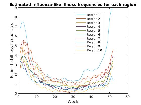
We observe a common pattern across regions, with estimated flu frequencies clearly declining after January and steadily increasing from fall to winter. Region 6 (Arkansas, Louisiana, New Mexico, Oklahoma, Texas) appears to have a significantly higher rate of estimated flu frequencies than other regions in fall and winter months.
From here we may want to study the median flu frequencies across regions, and look at the deviation for each week.
Box plots are a great way to do this, since they combine all the information about y value distributions for each x value into one clean graph.
Box plots
[X, ~] = loadFluTrendsData();
figure;
% Plot the transpose of X to use weeks as the x-axis and collect
% frequencies across regions for box plot data points.
boxplot(X');
% Mark every 4th week on the x-axis to minimize clutter.
xTicks = 4 * [1:size(X, 1)/4];
set(gca, 'xtick', xTicks, 'xticklabel', xTicks);
xlabel('Week'); ylabel('Estimated illness frequencies');
title('Estimated influenza-like illness frequencies across regions');
>> help boxplot
 boxplot Displays box plots of multiple data samples.
    boxplot(X) produces a box plot of the data in X.  If X is a matrix there
    is one box per column, and if X is a vector there is just one box. On
    each box, the central mark is the median, the edges of the box are the
    25th and 75th percentiles, the whiskers extend to the most extreme
    datapoints the algorithm considers to be not outliers, and the outliers
    are plotted individually.
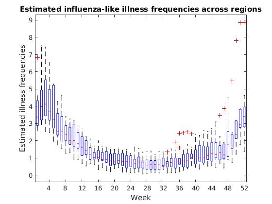
The box plot shows us a few significant values for each week. The red line inside each box displays the median, or the “middle” flu frequency across regions for that week. Half of all regions are above this value and half are below.
The top edge of each box is the 75th percentile for the week, or the flu frequency for which 75% of regions have a lower value. The bottom edge is the 25th percentile, or the frequency for which 25% of regions have a lower value.
It can sometimes be as useful to see where we have outliers in our data as it is to see the most common values, and the box plot marks these outliers with red “+” symbols.
Histograms
If we want to see how frequent various y-values are in our data set, we may want to consider a histogram.
Histograms are a great way to quickly view the overall distribution of data, grouped into “buckets” or ranges of x-values.
[X, ~] = loadFluTrendsData();
figure;
% Combines all regions to show a simple view of
% overall frequencies across the data set.
hist(X(:));
xlabel('Estimated flu-like illness frequencies across U.S.');
ylabel('Number of occurrences of that frequency');
codeForNewLine = 10;
title(['Frequencies of influenza-like illness', codeForNewLine, 'percentages across weeks and regions']);
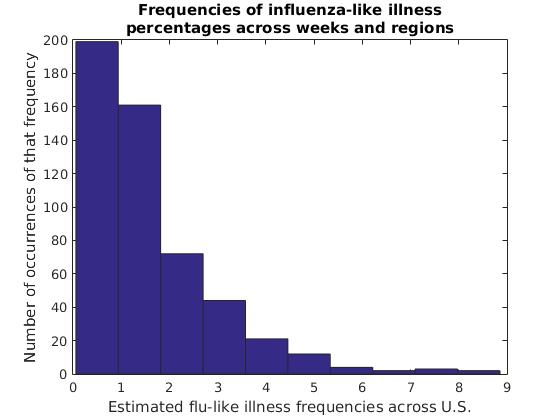
In this data set, flu frequency estimates of 0%-1% are clearly most common, with each range of higher flu frequencies becoming increasingly rare. This isn’t as interesting of a curve as we might find for other data sets, but sometimes a histogram can give us interesting insights into the distribution of our data over ranges such as age groups, income levels, light intensities and other groups of values both continuous and discrete.
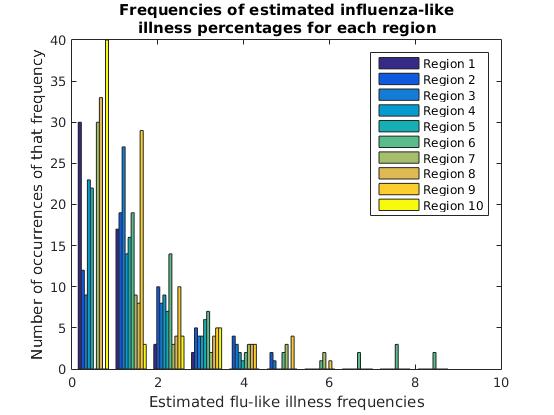
We can also view the y-value distributions for each column separately. Here, this is the estimated flu frequency distribution for each region.
[X, regionNames] = loadFluTrendsData();
figure;
% Display a histogram of each region's illness frequencies.
hist(X);
xlabel('Estimated flu-like illness frequencies');
ylabel('Number of occurrences of that frequency');
newLineCode = 10;
title(['Frequencies of estimated influenza-like', newLineCode, 'illness percentages for each region']);
legend(regionNames);
Scatter plots
The final type of plot we’ll look at in this post is the scatter plot, applied to comparing two columns or features of our data set.
A scatter plot for a 1-dimensional data set of x and y values is simply a discrete XY plot, where every point represents an (x,y) value.
When we have a 2-dimensional data set, however, we can treat one column as our x-axis and a second column as our y-axis to plot the correlation between two features.
Instead of dumping our whole matrix into a graph, this time we’ll make use of Matlab’s matrix utility functions to calculate the correlations between every two columns (regions). Then we’ll draw scatter plots for the two regions with the highest correlation to one another, and for the two regions with the lowest correlation.
[X, regionNames] = loadFluTrendsData();
numRegions = length(regionNames);

% Correlations stores the pairwise correlations between
% every two regions (sides of the diagonal are equivalent)

% Set the diagonal to zero in order to calculate the max
% correlation between *distinct* regions (since every
% region has a correlation of 1 with itself)
Correlations = corr(X) - eye(numRegions, numRegions);
% Calculate the maximum correlation between distinct regions
maxCorr = max(max(Correlations));
% Find the pair with the maximum correlation
[maxRow, maxCol] = find(Correlations == maxCorr, 1);
% Get the names of the regions with maximum correlation
maxCorrRegionName1 = regionNames(maxRow)
maxCorrRegionName2 = regionNames(maxCol)

figure;
% Draw a scatter plot of the flu frequencies for the
% two regions with the highest correlation
scatter(X(:,maxRow), X(:,maxCol), 10);
xlabel(['Weekly flu frequencies for ', maxCorrRegionName1]);
ylabel(['Weekly flu frequencies for ', maxCorrRegionName2]);
title(['Scatter plot between two highest-correlation regions']);
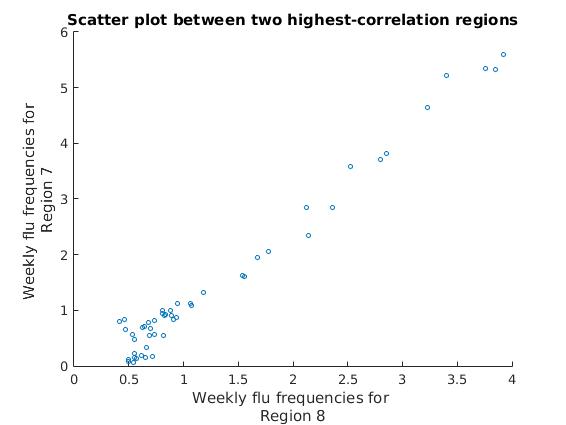
We can see that all of our data points are clustered into a single linear pattern, showing a very high correlation between these two regions’ estimated flu frequencies.
Let’s look at the scatter plot for the two regions with the lowest correlation.
[X, regionNames] = loadFluTrendsData();

% Correlations stores the pairwise correlations between
% every two regions (sides of the diagonal are equivalent)
Correlations = corr(X);
% Calculate the minimum correlation value in the matrix
minCorrVal = min(min(Correlations));
% Find the pair with the minimum correlation
[minRow, minCol] = find(Correlations == minCorrVal, 1);
% Get the names of the regions with minimum correlation
minCorrRegionName1 = regionNames(minRow)
minCorrRegionName2 = regionNames(minCol)

figure;
% Draw a scatter plot of the flu frequencies for the
% two regions with the lowest correlation
scatter(X(:,minCorrRegionCol1), X(:,minCorrRegionCol2), 10);
xlabel(['Weekly flu frequencies for ', minCorrRegionName1]);
ylabel(['Weekly flu frequencies for ', minCorrRegionName2]);
title(['Scatter plot between two lowest-correlation regions']);
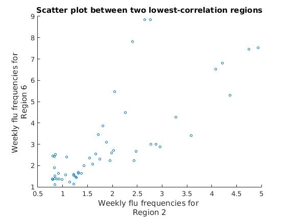
We can see that the approximately linear clusters of data points diverge for these two regions, showing a much lower correlation than with the previous two regions.
A common use of scatter plots is to generate a matrix of scatter plots between columns or features of interest, to demonstrate where there may or may not be clear linear or non-linear correlations.
There are a number of other types of data visualizations, such as heat maps, area charts, pie charts, hierarchical trees and others. Each uses slightly different methods to highlight different aspects of the data set.
Resources:
- Source code for this post’s Matlab plots: https://github.com/msayson/matlabPlots
- Illustrated list of common visualization types: http://guides.library.duke.edu/datavis/vis_types
- Visualizing Multivariate Data in Matlab: https://www.mathworks.com/help/stats/examples/visualizing-multivariate-data.html
- Google Charts library: https://developers.google.com/chart/interactive/docs/gallery
Footnotes:
- *Google Flu Trends attempted to estimate flu trends across countries by extrapolating from aggregated search queries. While the project was considered unsuccessful as a predictive tool and has been discontinued, other researchers have reported some success with combining aggregated search queries with data sets from Centers for Disease Control and Prevention. (http://arstechnica.com/science/2015/11/new-flu-tracker-uses-google-search-data-better-than-google/)